This last year brought into use some very impactful web design trends. Let me jump right in.
Full screen video backgrounds
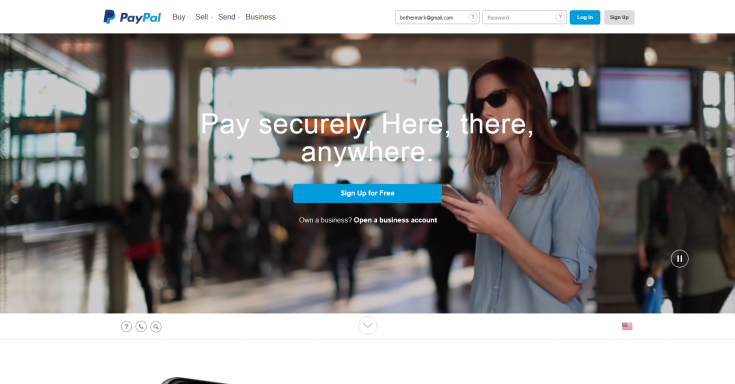
This might be the most prominent trend of 2014. Huge auto playing videos run silently in the background while text or other content is overlaid upon it. It adds a good deal of aesthetic value to the page, but could potentially distract from important content. At least I personally haven’t found that to be the case on most sites yet. Noticeably this has been seen in the new PayPal design.
[symple_divider style=”solid” margin_top=”30″ margin_bottom=”30″]Full screen photo backgrounds
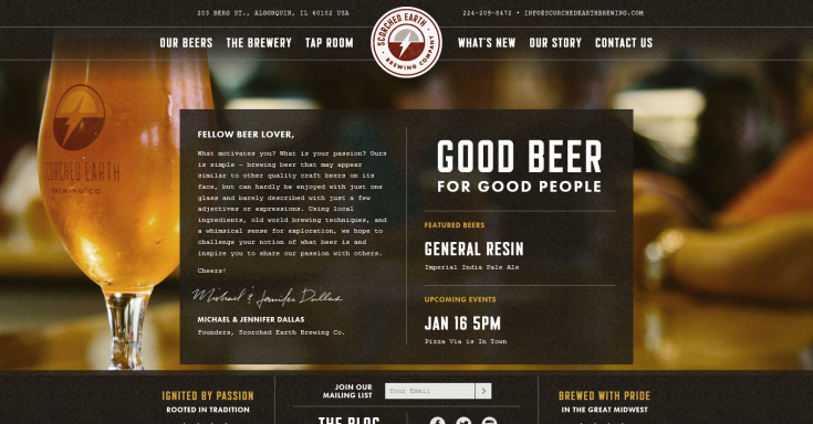
A similar effect is to display large full size photos in the background of a page. Typically in the hero unit, or throughout parallax sections. This makes a bold statement, and can really bring a design to life with the proper imagery.
[symple_divider style=”solid” margin_top=”30″ margin_bottom=”30″]Guided one page scrolling
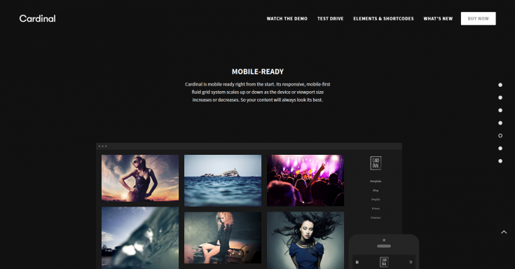
This trend may not be as prevalent as the first two, but it’s a relatively new effect that’s causing some commotion. Imagine your natural tendency to scroll down a page suddenly being taken over; somewhat locking into the next section. Often the sight of several vertical dots on the side of a page is an indication that this could happen.
[symple_divider style=”solid” margin_top=”30″ margin_bottom=”30″]Scroll activated parallax animations
A beautiful and interactive visual design style that’s been adopted by many app landing pages is being seen more and more. You’re scrolling from the top of a page toward the bottom as an image begins to slide into the center as if out of nowhere. Suddenly as you continue down the page, a heading drops in and a paragraph fades into the foreground. This continues throughout your journey to the end of the page. These are scrolling activated animations. They’re very cool, and will likely be used into the future of web design, but hopefully never overly used. We shouldn’t distract from or delay access to content a user is looking for.
Web design trends I hope to see less of
- Overly flat design (almost flat adds better UI depth).
- Small body fonts (16px browser default is small enough).
- Content hiding hero carousels (provide content up front instead).
- Popups that appear immediately before a user has a chance to view your content.
- Mobile menus that do not provide an access button when you’re far down the page.
Are there any hot trends you’ve noticed around the web in 2014?


This Post Has 0 Comments